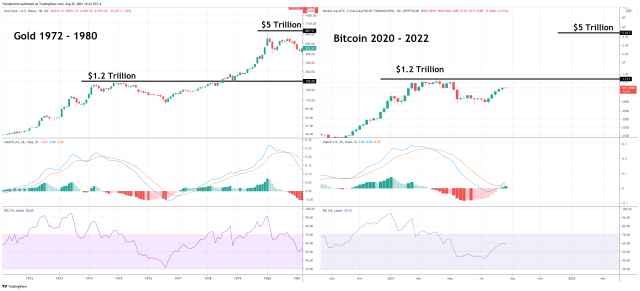
Bitcoin price is back near $50,000 after a massive shakeout following new all-time highs set this past April. While the market continues to debate whether or not a top is in, the top cryptocurrency by market cap has begun to resemble the price pattern of the 1970s gold bull run.
Interestingly, both assets topped out at around $1.2 trillion in market cap, only to pull back, recover, and rise to a total of $5 trillion before the next bear market – a bear market that lasted longer than crypto has been in existence. Here is a closer look at the fractal, and the chilling similarities between several market conditions between now and then.
Comparing Bitcoin To The Rise Of The Gold Standard
The digital gold narrative and the cryptocurrency market sucking capital out of precious metals contributed to the asset’s mid-cycle pullback this time around.
During the 1970s and following the unpegging of the dollar to the gold standard, the price per ounce rallied to unprecedented heights. Along the way, there was a mid-cycle pullback once the asset reached $1.2 trillion in market cap.
Related Reading | 50 Years Later: Why Bitcoin Is The New Gold Standard
After a deep correction, the market cap spiked to $5 trillion. Today, gold is worth more than double that in market cap. What is more interesting about this tale, is the fact that Bitcoin price also stalled after reaching $1.2 trillion. Could an enormous rally to $5 trillion be next for the top cryptocurrency? A comparison suggests so.

Could a $5 trillion BTC market cap be next? | Source: BTCUSD on TradingView.com
Bullish Bullion Fractal Matches Down To Technical Indicators
A bull resumption of the bull run in Bitcoin and a $5 trillion market cap would put the price per BTC closer to $250,000. But is it really possible?
With the Relative Strength Index turned on and the LMACD, the two technical indicators are also behaving eerily similar despite being more than forty years apart.
Related Reading | Elliott Wave Expert Sees “Greater Price Appreciation Unfolding” In Bitcoin
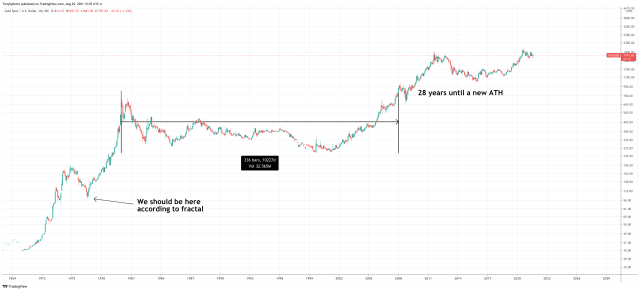
When the rally ended gold then started a 28-year long bear market before new highs were made again.

What a rally to $5 trillion would look like | Source: BLX on TradingView.com
The key difference between the two charts that doesn’t quite match up as well, is the timeframe. Gold’s rally took place across a decade, and the bear market that followed took nearly three decades to break free from.
Crypto markets never sleep, and with the added always on time, the same cycle that took nearly ten years in metals is only taking two years in Bitcoin.
With a more scarce supply and other conditions that make Bitcoin unique, the results could ultimately differ. But for now, the two rallies are tracing alongside one another well, and depending on where the top cryptocurrency goes from here, we’ll soon know if this golden roadmap was valid or not.
This is a great comparison. Have you noticed the indicators are also similar between the two? RSI + LMACD. Nice find. pic.twitter.com/fInUR08adm
— Tony "The Bull" Severino, CMT (@tonythebullBTC) August 25, 2021
Follow @TonySpilotroBTC on Twitter or via the TonyTradesBTC Telegram. Content is educational and should not be considered investment advice.
Featured image from iStockPhoto, Charts from TradingView.com


